Cosmetics Packaging

VERSO SKINCARE

Zurück Download

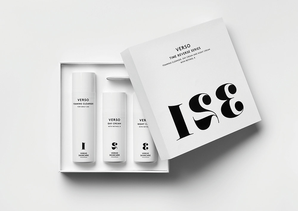
The packaging for this new skincare brand from Stockholm, Sweden, realises a holistic concept for the communication of a product that possesses proven characteristics for protecting against skin ageing. The aim was to create a new premium brand imbued with the appearance of simplicity and effectiveness. This is emphasised by a reduction in colour to pure black and white on the one hand, and through the product naming with the chosen typography on the other: “Verso” is Latin and means reverse. The overall clear design of the packaging is intended to refer to a “reversal” in time of the signs of ageing, visualised through an expressive typography with numbers that are printed in reverse. Merging product and packaging into unity, this concept thus aims to embody a new approach that appeals to a target group with a modern sense of lifestyle and to conquer a new niche in the field of cosmetics.

Begründung der Jury

In the category of cosmetics, this packaging occupies a position that can well be called bold and special. The reduction in colour to black and white harmonises with the sophisticatedly designed and successfully implemented idea that this crème facilitates achieving a younger look. This “reversal” is also visualised effectively by the typography. The packaging design merges elegance and purism into the appearance of freshness and clarity.

Red Dot: Best of the Best

Andere interessierte auch