Beverage Packaging

Guoyuan-Auspicious China

Zurück Download

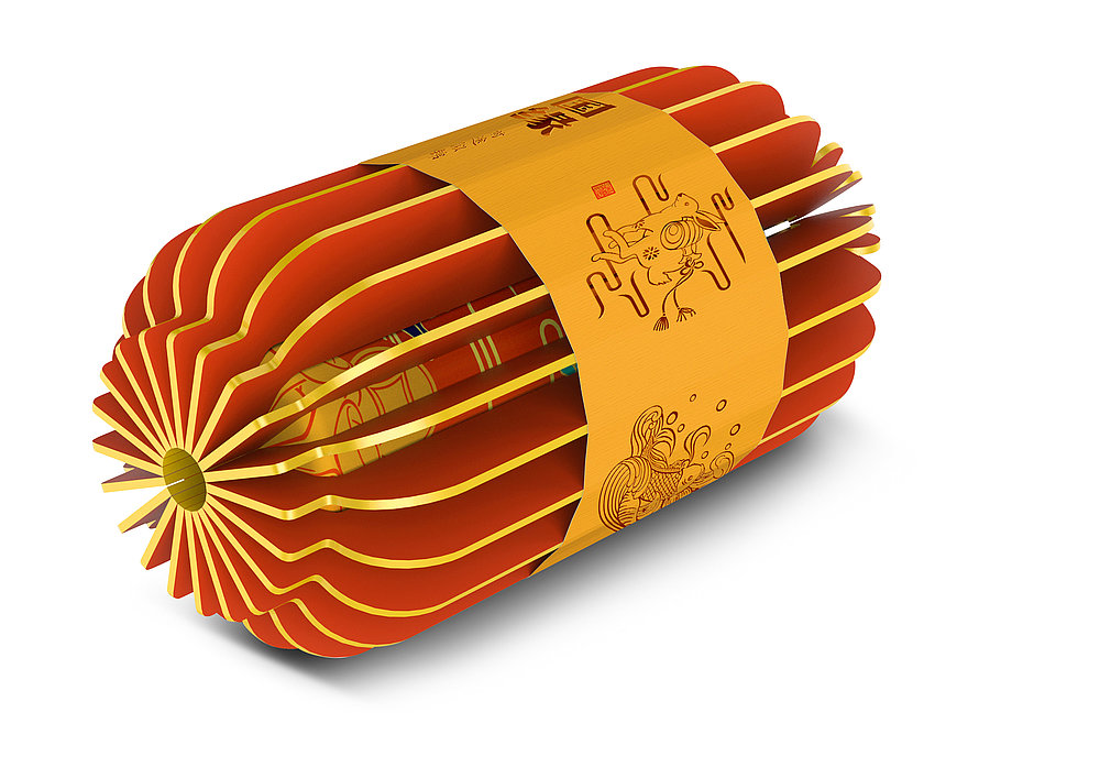
The packaging design for this series of liquor products selected three Chinese idioms as inspiration for their individual illustrations: “as old as a crane”, “carp leaps through the dragon’s gate” and “a golden future”. All of the three animals – crane, carp and hare – symbolise people’s hopes and yearnings for longevity, promotion and success. The background features a choice of bright colours with specific meanings. While turquoise stands for safety and health, joyous China red symbolises success and the elegant Kumquat orange is the colour for wealth, but also evokes a certain kind of comfort and warmth. The fine drawings of the animals and landscapes on the bottles artistically reflect the style of Chinese art. Complemented by an ingenious cardboard envelope, which unfolds like a fan and when folded together takes the shape of a traditional Chinese lantern as a symbol of encounter and reunion, this packaging has emerged as a harmonious and consistent work.

Begründung der Jury

In terms of form and content, this packaging design offers more than an aesthetically appealing exterior: while the bottles already stand out with a distinctive colouring as well as finely crafted, precise traditional-style drawings, the sophisticated packaging in the form of the classic lantern, which is usable as a stand-alone object or to hang up, surpasses all expectations.

Red Dot: Best of the Best

Andere interessierte auch