Orientation System

Innsbruck Exhibition Centre

Zurück Download

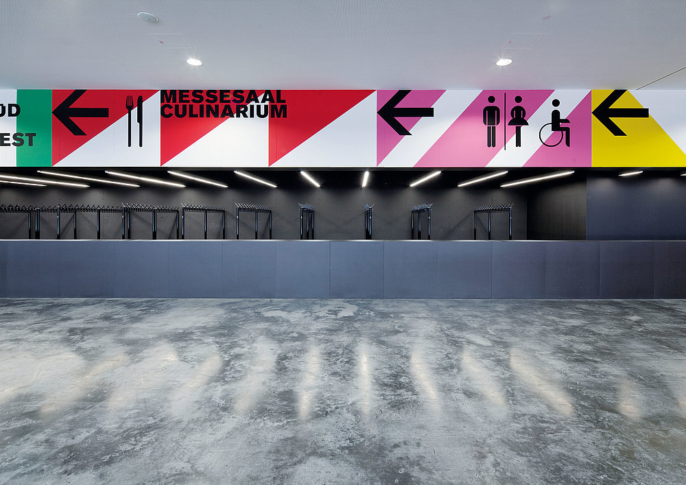
The Innsbruck exhibition centre comprises several and, in part, historical buildings that were complemented in 2011 by a new main entrance with highly functional architecture. The aim of the new signage system was to give the visual clutter of different styles coexisting in the buildings themselves and the wayfinding system a clear, overall harmonious appearance. National flags of countries intrinsic to the exhibition centre’s business serve as the concept’s graphical foundation. The flags were divested of their heraldic elements, including shields, animals, swords, sabres and stars, as well as their national colour schemes, and then allocated a single colour shade along with text. Differentiated in form and colouring, the individual text patterns were assigned to particular halls, while the individual signs also feature different graphic patterns that fulfil a wayfinding function. The result is a systematic chaos, an orderly disorder consisting of brightly coloured panels that boldly stand up against the intrinsic non-uniformity of the particular location. In the rather functional new building, they provide a rhythmic element that covers whole walls such as in staircases, the restaurant and the underground car park.

Begründung der Jury

The design of this signage system convinces with the innovative solution of combining orientation with decorative elements. It responds to the different coexisting architectural styles of the buildings with a system comprised of individual colours, forms and letters that vary depending on the location, yet safely and consistently guide visitors to the location they are looking for.

Red Dot: Best of the Best

Andere interessierte auch