Brand Identity

Key4Life

Zurück Download

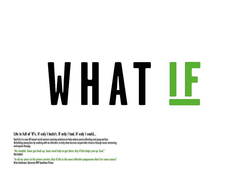
Key4Life is a charity creating innovative solutions to help reduce youth offending and gang warfare. It works with young offenders within and outside the prison, using a variety of means such as music, equine-facilitated social rehabilitation and mentoring to encourage them to find a new path in life. Following meetings with key stakeholders and young offenders, a strategy around the concept of “What If” was developed based on the idea that life is full of “what ifs”. It is a simple, clear idea that became part of the brand message and runs throughout the creative expressions designed in distinctive capital letters. Alongside the striking logo, the brand identity encompasses the colour palette, typography, photographic style and a broad range of communication media including stationery, a website and a fundraising brochure. The key objectives were to create a brand that would encourage potential donors to identify with the programme and that young men in prison could relate to. In the months following the relaunch of the brand, Key4Life saw an impressive increase in its donations.

Begründung der Jury

The design of the brand identity for this charity organisation is excellent – the posters in particular are immediate and direct. The website is clearly structured and marked by an easy-to-understand, fresh appearance that makes playful use of the logo in an unusual approach. The use of colour and typography is just as outstanding.
Red Dot: Best of the Best

Andere interessierte auch