Promotional Poster

Cheburashkini Brothers

Zurück Download

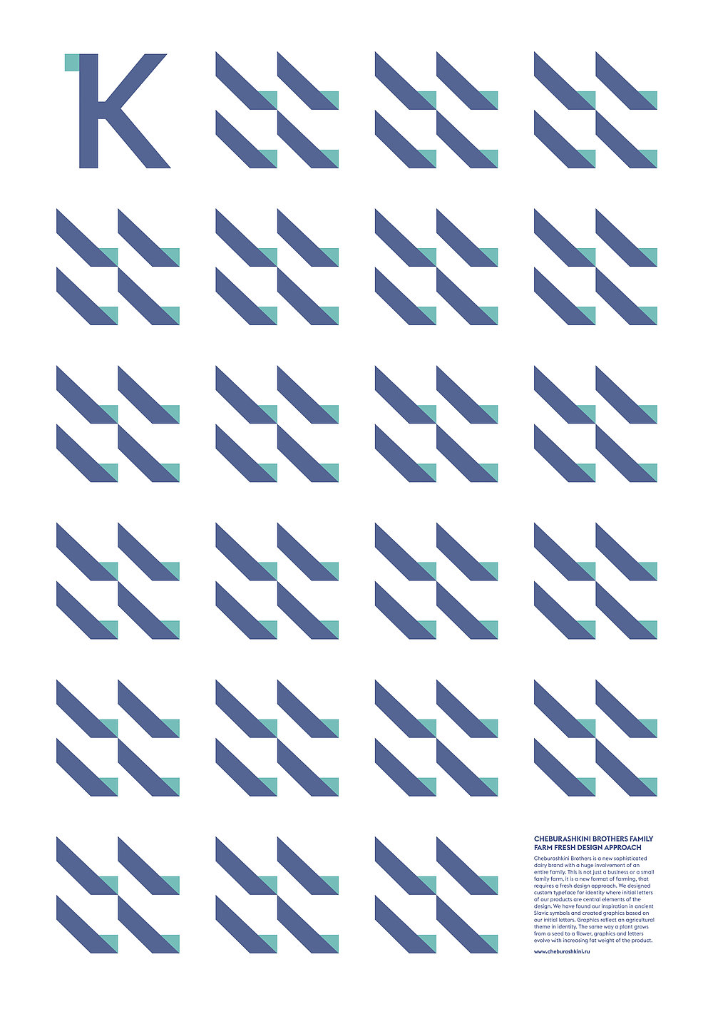
This poster series is part of the identity design for the Russian dairy brand Cheburashkini Brothers. Its main idea is based on typography, respectively the first letters of the products. A display sans-serif typeface with a set of weights was developed together with a system of graphics inspired by ancient Slavic symbols for seed, grass, earth or other things related to farming. They appear as additional design elements of the identity and play a crucial role, particularly in the creation of the posters. The posters take the first letter of one of the dairy products as their starting point, while the graphics are layered and interwoven around the letter for creating super-imposed images using the matching symbol on a clear, uniform grid. With only two matt colours, a prime colour for the letters and a supporting colour for the graphics, this results in interesting minimalist and contemporary designs.

Begründung der Jury

What makes this system, developed for dairy products and based on initials and symbols, stand out is, on one hand, its derivation from ancient Slavic symbols for elements of agriculture and, on the other, the resulting ultra-modern and reduced style of the icons. Simple, clear and modular in use, they form the basis for these unusual and fascinating posters, the design of which perfectly captures the freshness of the products they represent.

Red Dot: Best of the Best

Durch Starten des Videos erklären Sie sich damit einverstanden, dass Daten wie z.B. Ihre IP-Adresse an Vimeo übermittelt werden. vimeo.com/privacy

Andere interessierte auch