Brand Identity

Arla Baby & Me Organic

Zurück Download

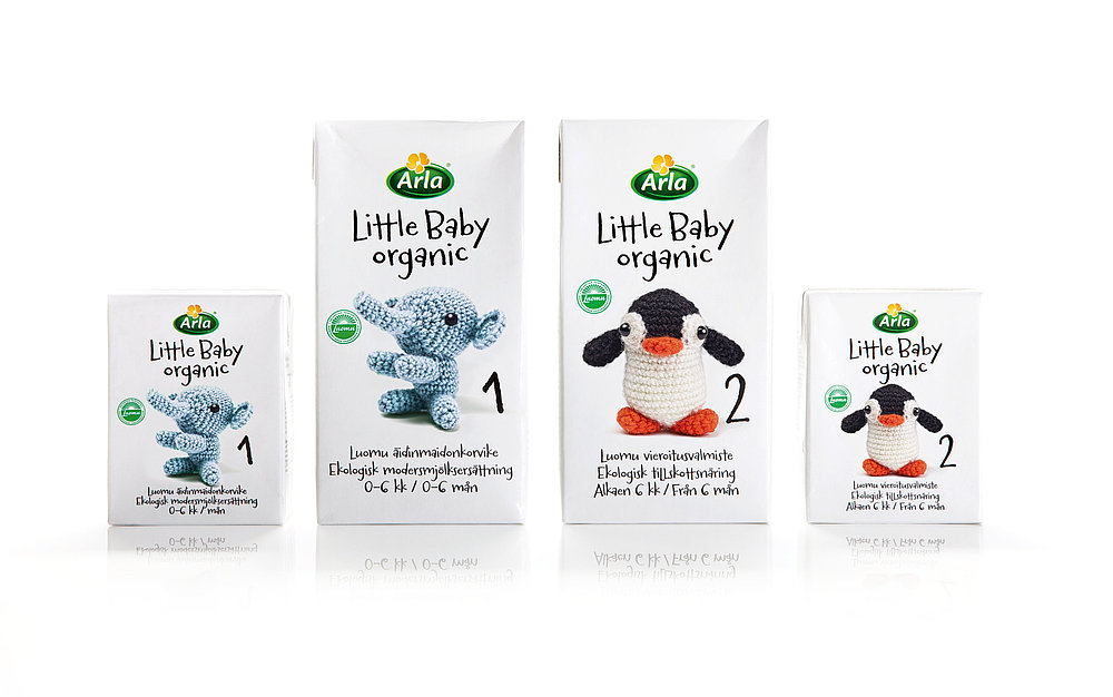
The new organic brand of Arla Ingman, a Finnish branch of the global dairy company Arla Foods, aims to appeal to mothers. Being the most important communications tool, the packaging played a notable part right from the beginning. Knitted animal figures, including an elephant, a penguin and a fox, were designed as visual identifiers for the product family. The reduced and simplified brand identity, together with a playful typeface, communicates the key brand values: purity, openness and reliability. As a result, the packaging line can be distinguished clearly from other infant nutrition brands in the market, both in Finland and abroad. The soft, knitted animal figures and a fresh layout make this identity appealing to children, triggering their desire to keep them. The new design of the 100 per cent organic product line is pure and innocent, the very values that people ascribe to babies.

Begründung der Jury

The design of this brand identity fascinates with its clear, unmistakable visual appearance. Nothing distracts from the message of purity and dependability associated with these dairy products and ingredients for the little ones. To convey this, the use of black and white as well as knitted animal figures suffices. The implementation thus not only presents an aesthetically outstanding solution, it also conveys credibility.
Red Dot: Best of the Best

Andere interessierte auch