Brand Identity

Moscow Identity

Zurück Download

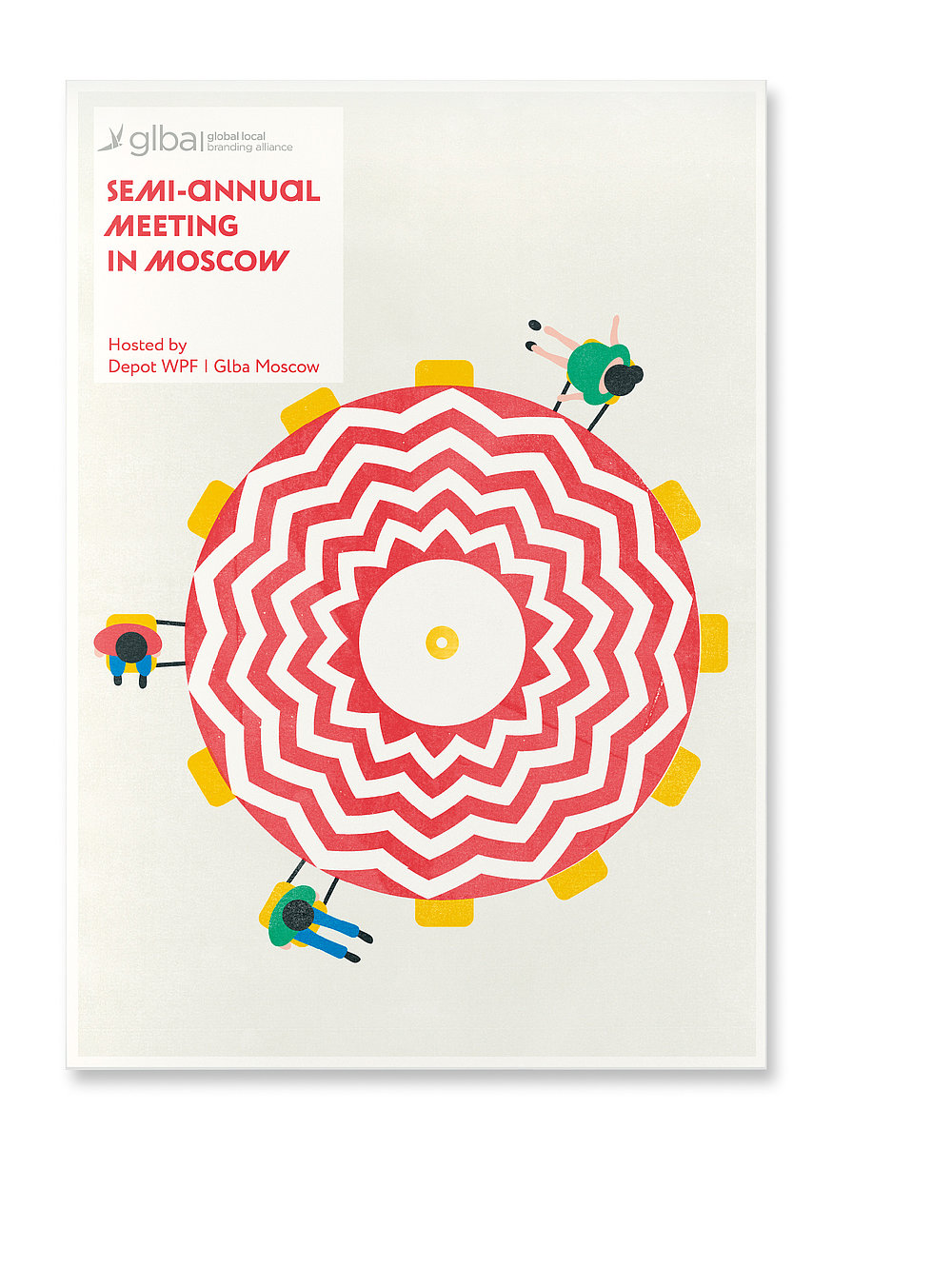
The brand identity for the semi-annual meeting of the Global Local Branding Alliance (GLBA) in Moscow started with a question: How can this city, its mood and authenticity be explained to a foreigner only staying in Moscow for two days? The answer was: With the city itself! The identity is based on three main pillars. Firstly, there is the radial design of the city as it grows in rings, such as the boulevard ring, the garden ring, and a third ring with the Kremlin and Saint Basil’s Cathedral at the centre. Secondly, there is the city’s authenticity based on certain patterns typical of several of Moscow’s iconic places and sights. Thirdly, there is the positive mood which is shared by people who encounter the design. These ideas resulted in a rich and vibrant visual idiom, realised across a wide range of digital and analogue media, including the programme, the brand book, the spatial design and flags, all featuring a plethora of colourful and creative visuals that rendered the identity not only remarkably versatile but also tangible in the form of lollies, bags or bicycles.

Begründung der Jury

This brand identity captures the colourful architecture of the Russian capital in beautiful illustrations. It cleverly uses objects such as skirts and umbrellas, shown from above, to underline the circular design of the city. With its playful patterns, the gorgeous colour screen and visual style, the identity achieves a remarkable and likeable aesthetic.
Red Dot: Best of the Best

Durch Starten des Videos erklären Sie sich damit einverstanden, dass Daten wie z.B. Ihre IP-Adresse an Vimeo übermittelt werden. vimeo.com/privacy

Andere interessierte auch