Packaging

Cookit

Zurück Download

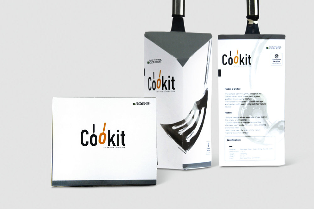
Camping is fun, although it requires quite a lot of equipment and other things that need to be prepared beforehand. Cookit aims to save campers from all this inconvenience with the packaging for a product range consisting of a pot, a bowl, cups and a set of spatulas as well as a ladle that can overlap creating a triangular shape. These elements complement each other and are characterised by a corporate design that stands out with a clear, elaborate appearance. The logo features two “o’s” with handles, creating the association with a frying pan, as the only element in the visual identity that introduces a bit of colour into the packaging design, which is otherwise entirely kept in black and white. Thanks to the slightly off-centred positioning of the orange “o”, the logo with its simple typeface exudes a sense of playfulness that is also taken up by all other graphics and photographs. The pan, cups and the spatula are presented in a visually distorted manner, lending them a dynamic appearance and wit. Thanks to the unusual shape of the packaging, the items can be stowed away quickly and easily together with all other camping equipment.

Begründung der Jury

Cookit immediately attracts attention with its unusual formal design that makes the individual products easy and convenient to transport. In terms of its visual identity, the packaging design convinces with its two-coloured logo that creates a reference to the topic of camping and, together with the exceptional photographs, turns it into a true eye-catcher.
Red Dot: Best of the Best

Andere interessierte auch