Packaging

DUO Condoms

Zurück Download

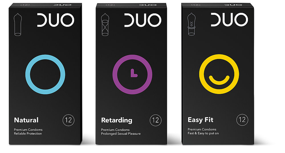
In order to update the worldwide look of DUO’s brand identity for new target audiences and refresh its market presence, a new language of communication was reviewed based on emoticons, shortcuts, symbols and condensed messages. It projects an original and contemporary idiom that is legible by all and adaptable to all national markets, respective cultures and, in particular, religious or social sensitivities. The logo has been cleared and reduced to the absolute essentials so that it is well integrated within the packaging surface. Thus, the emphasis is directed to the mid-placed circle, one of the most significant, primordial forms, and also the characteristic sign and appearance of a condom. In order to address the multiple variations of DUO condoms, the playful, sensual lexicon of a “DUO-coded” language was developed that emerges colour-coded, in vibrant tones, on stark black surfaces. Thus, the circle-based abstract design and the outlines refer, for example, to fruits for the flavoured variety, to a clock for the retarding variety, or machine joints for the G-Pleasure model.

Begründung der Jury

The new packaging design of the DUO brand convinces with a very clear and simple graphic design. The message thus becomes instantly clear and, thanks to the use of distinctive icons, is furthermore conveyed tongue-in-cheek. The product line itself catches the eye easily and, at the same time, makes differentiating between the different varieties highly intuitive.

Red Dot: Best of the Best

Durch Starten des Videos erklären Sie sich damit einverstanden, dass Daten wie z.B. Ihre IP-Adresse an Vimeo übermittelt werden. vimeo.com/privacy

Andere interessierte auch