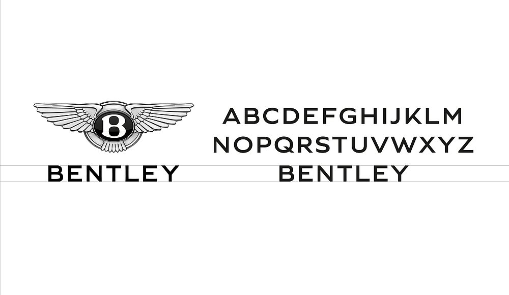
Bentley Motors stands for a breathtaking driving experience, hand-crafted luxury and unmistakeable design. The aim was to develop an independent corporate typeface that would stand apart from the previously used Gil Sans, yet without losing the typical character of a traditional English sans serif. A complete set of upper- and lower-case characters in two versions, each with four typestyles, was developed on the basis of the Bentley wordmark. The main design idea was the distinctively curved “power line” prominent in the vehicle design.