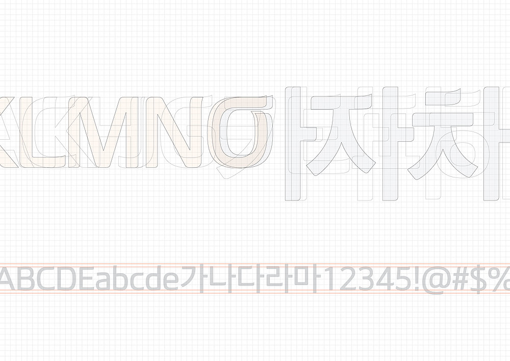
Corporate Typeface

olleh neo

Zurück Download

The olleh neo corporate typeface reflects the philosophy of the IT brand olleh, which pursues the objectives of boundless innovation and excellent service. A subtle flying curve represents telecommunication waves. By balancing the different proportions of the Korean and Latin alphabets with regard to their distinctive characteristics, this typeface allows both alphabets to blend perfectly with each other. These proportions are also consistent among the numbers and special symbols.

Red Dot

Andere interessierte auch