Poster Campaign

Faith

Zurück Download

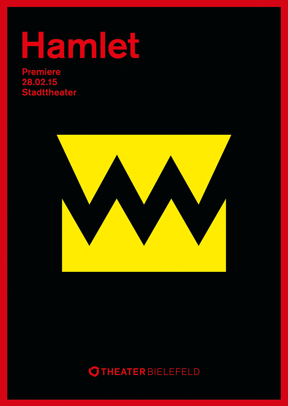
Theater Bielefeld has been an influential institution in its hometown for more than a century, over the years earning the faith of the local population. Faith gives rise to the questions and doubts that are the subject matter of good theatre. “Faith” was therefore the motto chosen for the design concept for the 2014/2015 season. The aim of the deliberately bold depiction of the plays was to ensure that the artwork could be used both for programmes and seasonal brochures, as well as for the posters and that it would work equally well as advertising in A4 and DIN long formats. This led to the development of images for different plays that are both striking and eye-catching. Take for example the illustration for “Hamlet” which shows a simple yellow crown and its counterpart on a black background – the two typical signal colours. This illustration impressively conveys that the crown, which the brother and murderer of the king unlawfully claimed for himself, is in danger. The poster is also clean and strong in its use of typography, doing without any flourishes – a further symbol of commitment.

Begründung der Jury

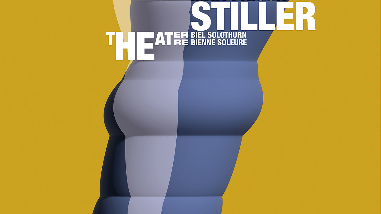
The poster campaign for Theater Bielefeld appeals with its striking image concepts that are both eye-catching and intriguing. They subtly summarise the content of the plays and are unmistakable in their message. The playful use of basic graphic shapes and the plain, clearly legible typography transport the key concept of the design identity in a very appealing way.
Red Dot: Best of the Best

Durch Starten des Videos erklären Sie sich damit einverstanden, dass Daten wie z.B. Ihre IP-Adresse an Vimeo übermittelt werden. vimeo.com/privacy

Andere interessierte auch