Typeface

MyLOTTE

Zurück Download

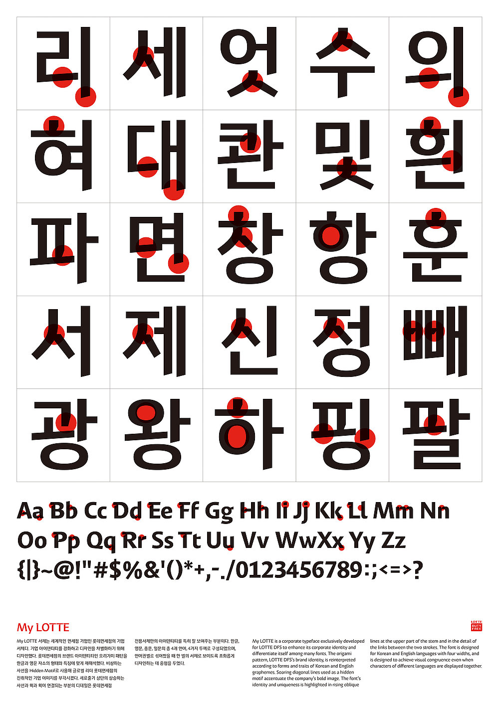
The MyLOTTE typeface was designed for one of the leading duty free shop companies, LOTTE DFS, in order to communicate more effectively with its customers. The font aims to enhance the brand identity by reinterpreting the origami pattern of LOTTE’s brand identity in line with the forms and traits of Korean and English graphemes. Hidden motifs of soaring diagonal lines accentuate the adventurous corporate image of the company. The identity of the font is shown in rising oblique lines at the upper parts of the stem and in the details of the parts where the lines meet. They are shaped with folds and carvings creating a distinctive expression. The font’s modern concept is further enhanced with a visual flow line placed above halfway, while ensuring high legibility through the organic emphasis of a horizontal writing system. Designed for the Korean and English language with the four widths (light, regular, medium and bold), MyLOTTE creates visual congruence even when being written in multiple languages.

Begründung der Jury

The typeface of this Korean alphabet, for which a very simple sans serif was chosen, is outstanding in that it is very well executed and matches the form of its letters. Moreover, the letters reflect the plain and stand-alone forms of their Latin equivalents, evoking a truly expressive appearance. Thus, overall, the writing system convinces with a good combinability and a suitable form of text, as well as an inherent personality.
Red Dot: Best of the Best

Andere interessierte auch