Montblanc Corporate Typeface

Zurück Download

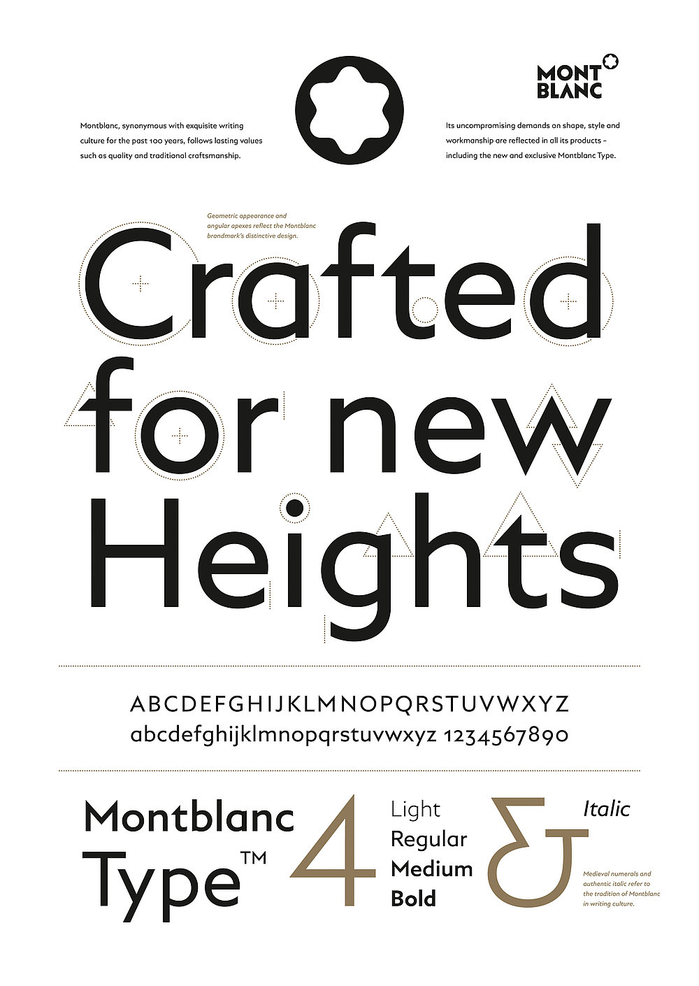
The newly developed corporate typeface for the tradition-steeped company Montblanc consistently incorporates the specific character of the trademark’s logo into the typeface, citing its unique graphical features in a subtle manner. The new font fulfils the task in both analogue and digital applications, in line with the company’s distinctive blend of understatement and attitude. The aim was to achieve a balance between typographical convention, in order to ensure readability and integrity, as well as originality, which is essential for the brand’s recognition and independence. The result is a typeface that reflects both of the distinguishing basic shapes used in the logo: the circle and the triangle. While the triangle is used for instance at the ear of the “g” or enclosing the cross stroke of the “t”, as well as at the upper and lower peaks formed by the diagonals of the “w”, the circle appears around the bowl of the “d” and the tail of the “t”. This new typeface thus blends seamlessly into the overall appearance of the brand, creating an intuitively harmonious impression on readers.

Begründung der Jury

The redesign of the corporate typeface for Montblanc masters the challenge of lending a modern appearance to a well-known, tradition-steeped brand, yet keeping the brand recognisable and thus respecting the brand legacy. The result is a well-balanced typeface that catches the eye with a design marked by excellent craftsmanship, and one which is suitable for both analogue and digital applications.
Red Dot: Best of the Best

Durch Starten des Videos erklären Sie sich damit einverstanden, dass Daten wie z.B. Ihre IP-Adresse an Vimeo übermittelt werden. vimeo.com/privacy

Andere interessierte auch